|
Sometime in the mid-fifties, Jock Kinneir found himself waiting at the same Green Line bus stop as David Alford, one of the architects in the process of designing a second London airport at Gatwick. On discovering that they were close neighbours, David asked Jock if he had ever designed a signing system for an airport. Although Jock’s answer was ‘no – nobody had’, he was nevertheless invited to undertake a study for one hundred guineas. Jock maintained that if he hadn’t used the same bus stop as David, all the signing commissions that were to follow may never have happened; including the UK road signs which followed in 1958, as a result of Gatwick, with an invitation from Ministry of Transport to design the signs for Britain’s new motorways.
 With the nation taking to the roads in unprecedented numbers, it soon became apparent that the existing network was inadequate, promoting the British Rail campaign ‘It’s quicker by train’ – which of course it was (if only you could find a seat!). So plans were made for Britain to follow Germany in the construction of new motorways, starting with the Preston by-pass, followed by the M1. With the nation taking to the roads in unprecedented numbers, it soon became apparent that the existing network was inadequate, promoting the British Rail campaign ‘It’s quicker by train’ – which of course it was (if only you could find a seat!). So plans were made for Britain to follow Germany in the construction of new motorways, starting with the Preston by-pass, followed by the M1.
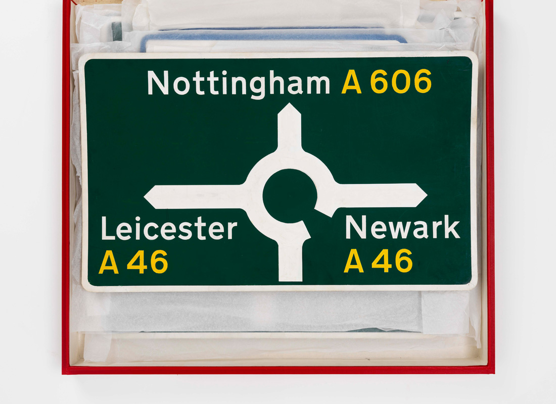
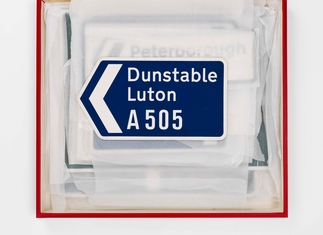
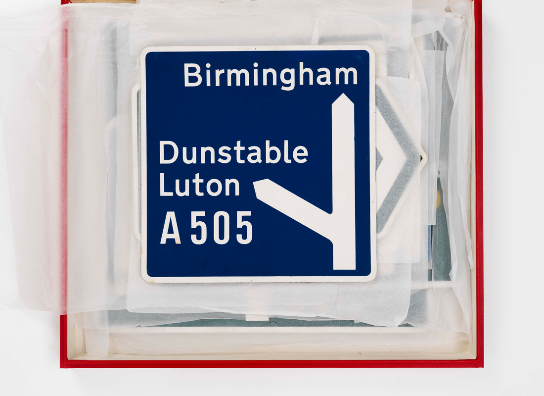
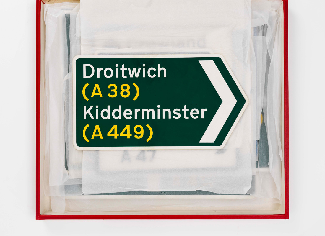
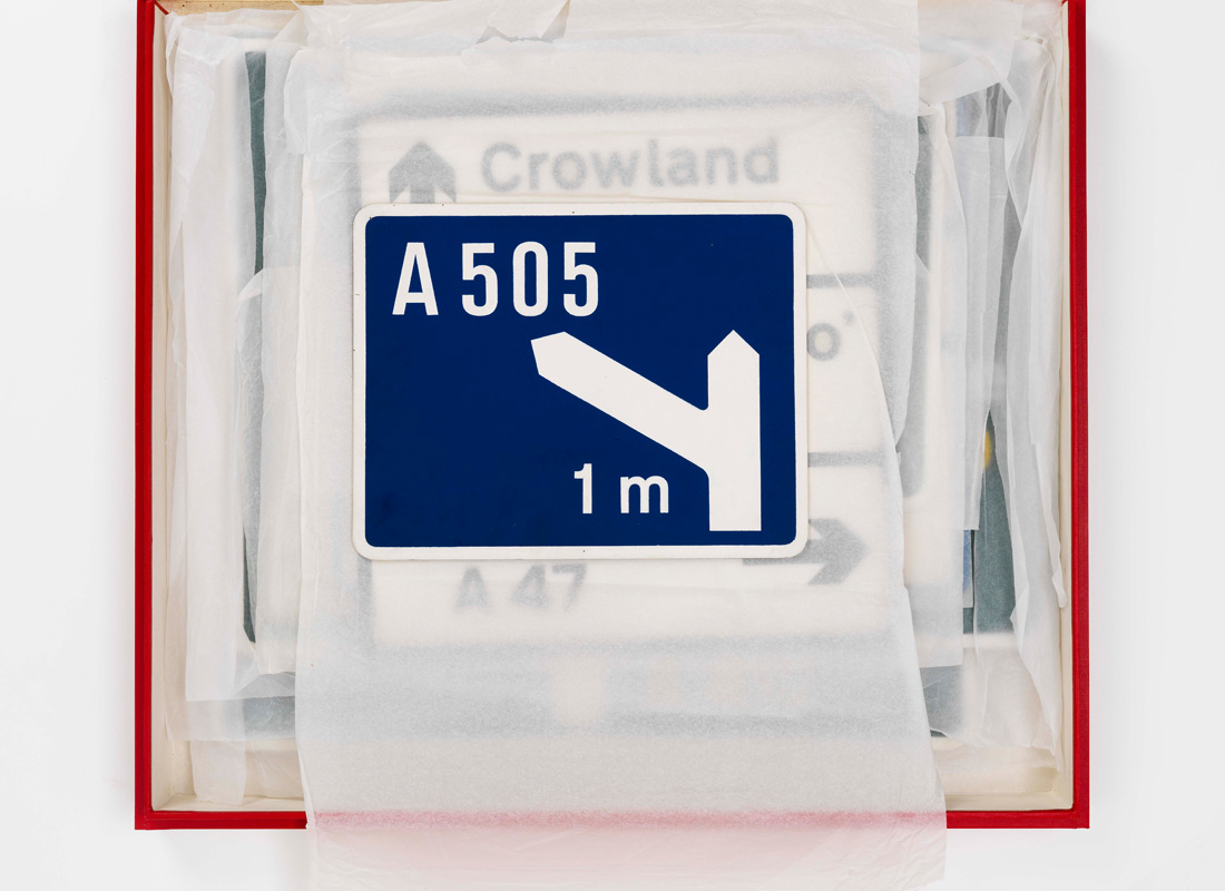
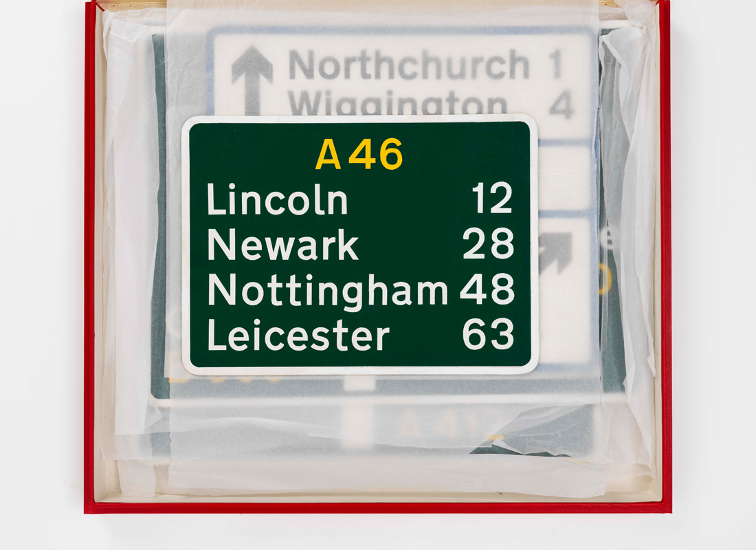
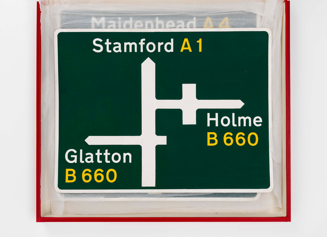
Signing the motorways became a major issue, as the current signs would fail to meet the needs of motorists travelling at high speeds. Sir Colin Anderson, having worked with Jock Kinneir on the design of a labelling system for P&O Orient Line, and aware of our work on Gatwick, approached Jock on behalf of the Committee, with a completely open brief, apart from the request to use white lowercase lettering on a blue background, in line with Germany. (Sir Hugh Casson, Chairman of the Fine Arts Commission, had a strong preference for green – ‘as dark as old dinner jackets’ – and it became the ultimate choice for primary ‘A’ routes).
After what must have been a stormy initial meeting, Jock received the following letter from Sir Colin: ‘I am anxious you shouldn’t embark upon inventing an alphabet of a character quite “new”. We have, as a committee, got into the habit of accepting the general weight and appearance of the German alphabet as being the sort of thing we need! I think therefore something on those lines is what the Committee believes it wants...’ (Letter dated 26 June 1958).
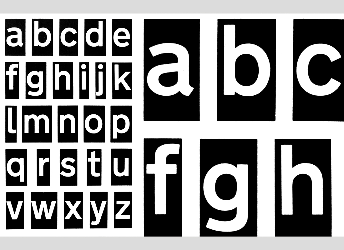
A request which we chose to ignore – believing that the German Sans serif (designed by an engineer), although demonstrably effective, would not sit well in the English landscape. So we started from scratch, with a specification for the ideal letterform, having looked at other possibilities, (including adapting the typeface Akzidenz Grotesk – a major influence regarding proportion and overall appearance).
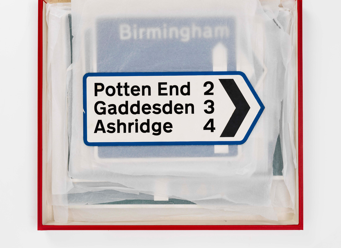
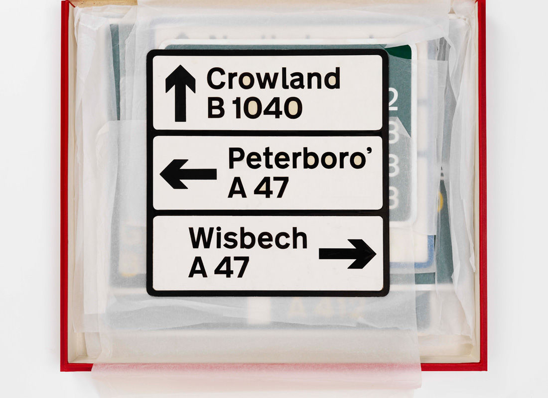
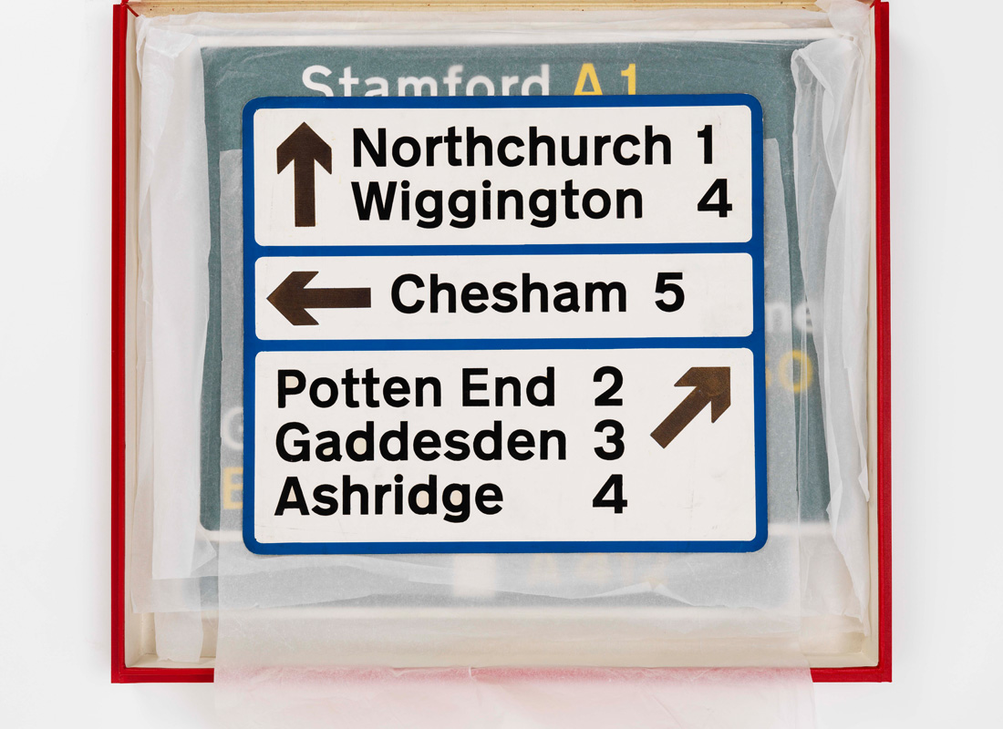
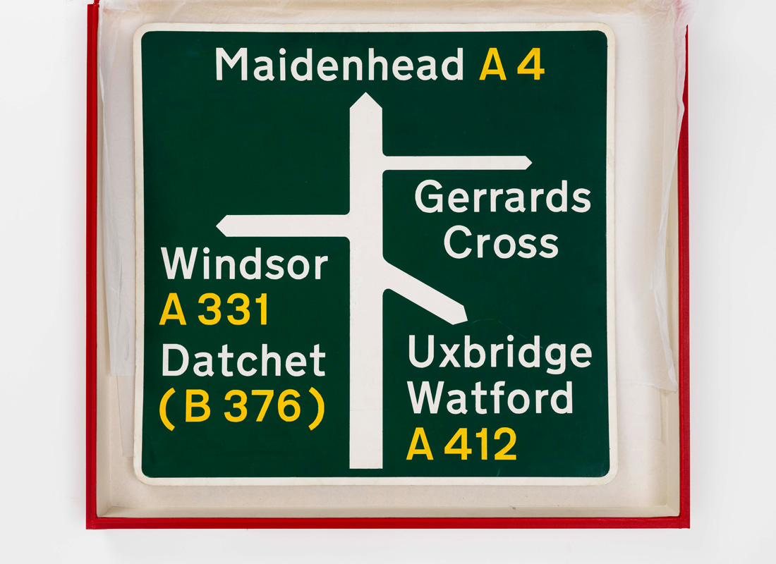
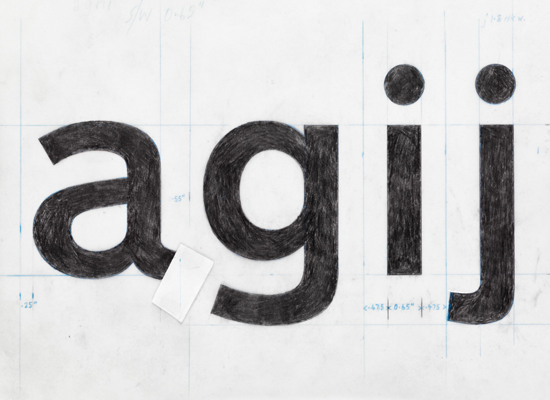
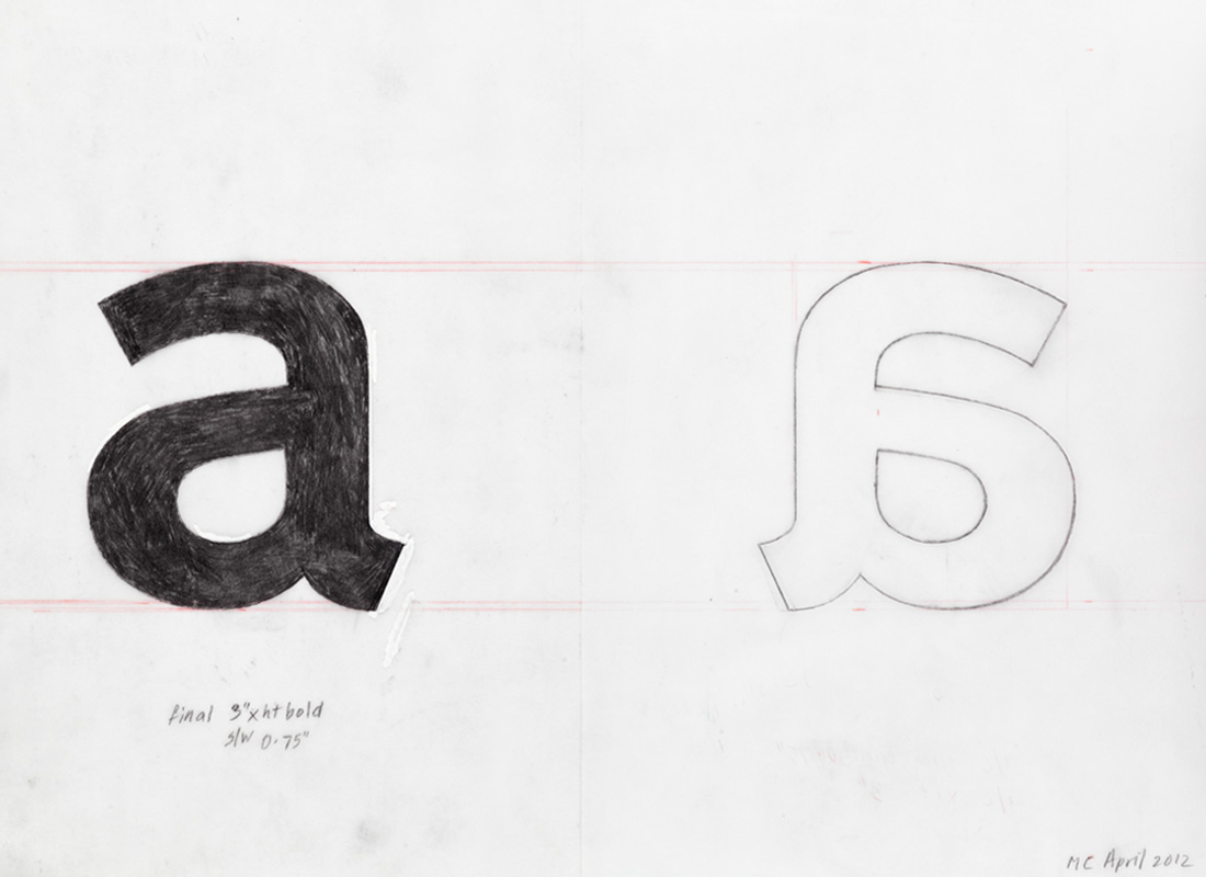
Important details, such as the curve on the end of the lowercase l (borrowed from Johnston), and the obliquely cut curved strokes of the letters a, c, e, f, g, j, s, t and y, were specifically designed to help retain the word shape of place names when slightly letterspaced; a necessary compromise to offset the effect of ‘halation’, when viewed at the appropriate ‘decision-making’ distance, in full glare of headlights. (Much like a Rembrandt portrait – with brush strokes merging to focus the image). This specific letterform, after two attempts, and in two weights, was officially named ‘Transport’.
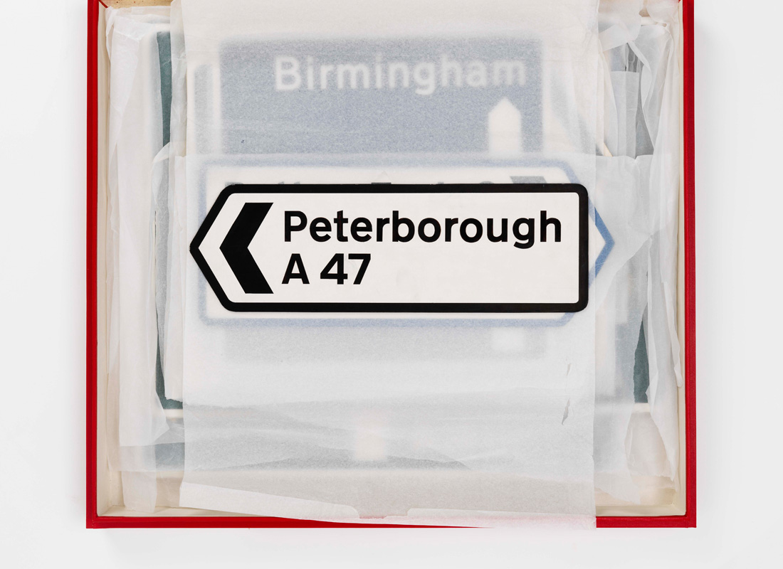
After the official opening of the Preston by-pass, in 1959, the new signs soon came under fire from the lettering establishment; notably the stone engraver and lettering designer David Kindersley who, uninvited, had for sometime been working on a new seriffed letterform, in capitals only, specifically for use in black letters on a white background. He was passionate in his belief that his oddly weighted seriffed ‘alphabet’ was the ultimate answer, regarding both legibility and economy. (Appearance didn’t seem to matter.)
Kindersley’s unprofessional intervention succeeded in generating a heated debate in the letter columns of several respectable newspapers; gaining support from such luminaries as Stanley Morison, and other outraged typographic traditionalists. Design magazine was quick to counter, with positive comments in our favour from Herbert Spencer and Colin Forbes, (both past presidents of AGI), making a strong case for Modernism.
Thus the scene was set; and in true democratic fashion, despite public acclaim and the full support of the Committee, tests were soon initiated by the Road Research Laboratory to settle the issue. Rather comically, several volunteer airmen from Benton airport in Oxfordshire found themselves seated on a tiered platform, in the middle of the airfield, while a car drove towards them with alternate combinations of signs mounted on the roof; composed of place names in Kindersley, Transport, and for good measure the 1933 Johnston-based standard, still to be found in parts of central London. Ironically, Kindersley’s seriffed letters proved to be 3% more legible than Transport – a negligible amount given the unrealistic conditions governing the tests. As a consequence, the ultimate choice rested on appearance. In the words of one observer, ‘Kindersley’s letters were just so ugly.’
It was T.G. Usborne, a far-sighted civil servant serving the Committee, who succeeded in persuading the Ministry to set up a second committee, chaired by Sir Walter Worboys, to take the entire road network into account. This made good sense, as the system dictating the layout of the signs, based on the width of the capital letter ‘I’, which Jock Kinneir so brilliantly devised, would quite naturally accommodate other route classifications. Jock always maintained that this was through good fortune more than forethought. Having worked so closely with Jock, it was more likely his innate ability to marshal a complex number of factors, based on common sense, into an elegant and comprehensive statement.
The Worboys Report, published in 1963, was presented to Parliament by the Minister of Transport, Ernest Marples, during the premiership of Harold Macmillan, on 9 December 1964. It came into effect on 1 January 1965, under the title ‘The Traffic Sign Regulations and General Directions 1964’ – six years since the first meeting of the Anderson Committee.
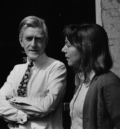
Margaret Calvert, London, 2006
First published in AGI: Graphic Design since 1950.
Published by Thames & Hudson, 2007
|